Death of the Pie Chart?
Humans seem to love the symmetry of circles, and the business world has adopted this pleasing form in the shape of the Pie Chart. KRS now challenges our clients to consider the graphs we use, as the data representation must be very closely aligned with the information intended to be conveyed.
Statistics may lie, and they lie most consistently through misleading data representations as you will read below.
Stephen Few has written at length in the past about the failures of pie charts and circular dashboard gauges, and his comments are a good illustration of what goes wrong when tools encourage “nice looking” graphs that don’t truly convey the data properly.
From Stephen Few, Perceptual Edge:
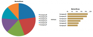
“Although the evidence of a pie chart’s dysfunction is hard to ignore when you actually take a moment to inspect it, nothing that I teach is met with such fierce opposition as my low opinion of them. People cling to them aggressively. But it is almost always difficult to compare the slices of a pie, because visual perception supports only rough comparisons of areas and angles, which are the two primary ways that pie charts encode quantities.
Circular gauges—the darlings of dashboards—waste space, but there is none to waste on a dashboard where a great deal of information must be displayed in a single screen. Nevertheless, software vendors insist on populating their chart libraries with every imaginable variation of cute gauges and speedometers, such as the typical examples from Dundas shown here.

When we intend to inform, which is the essential purpose of data visualization, we can’t select the form of the display arbitrarily: the form must be selected to support the intended function.
The chart below was published in Bloomberg in January of 2009. The title and legend make it clear that the market values of banks in quarter 2 of 2007 are being compared to their values in early 2009, after the credit crash had wreaked its havoc. It isn’t obvious, however, that the specific purpose of this particular visualization was to show that J.P. Morgan suffered a lesser decline than all but one bank: Santander.
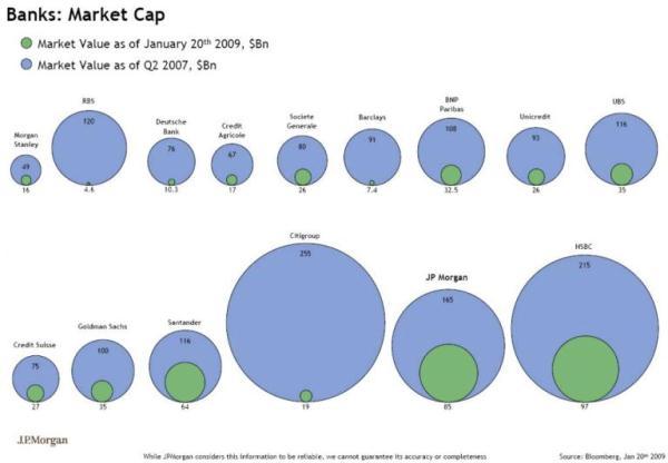
The primary failure that I want to point out, however, is not its failure to clearly support its purpose, but the fact that the designer responsible for it couldn’t help using circles to represent the values, despite their inability to deliver. We simply can’t compare the circles and get a good sense of their differences. Taking J.P. Morgan as an example, would you ever guess that its market value before the crash was slightly less than double its value afterwards? Actually, in this particular case if you did perceive it in this way, your perception would be way off, because the size of the green circle is actually much less than half the size of the blue circle, which is due to the fact that the designer mistakenly used the diameters of the circles rather than their areas to encode their relative values. Even knowing this, we still can’t easily compare the diameters, because our eyes are naturally inclined to compare their areas, which are almost impossible to ignore.”
At KRS, we work closely with our clients to design large databases full of information. However, we need to be more vigilant around representing the data in meaningful ways, as shown by Stephen Few. Many modern BI tools encourage the use of “pretty” over “useful”, and we are sure that many readers of this newsletter extract will now be looking at data formatting with news eyes!
About the Author:
Stephen Few has worked for over 25 years as an IT innovator, consultant, and teacher. Today, as Principal of the consultancy Perceptual Edge, Stephen focuses on data visualization for analyzing and communicating quantitative business information.